To even start discussing dashboards, you need to know what they are. Let’s begin with the idea that dashboards are somewhat like a data collection center. For example, in movies, when they show the main villain’s room, there is usually a huge wall with various indicators. Now we can have such a wall (and here is the moment for an evil laugh!). To illustrate this more, look at the following image:
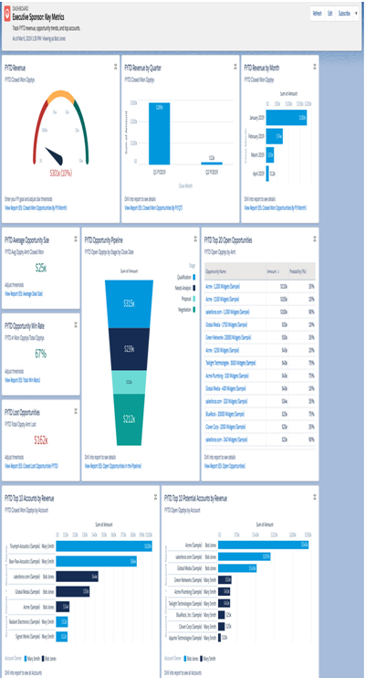
Figure 8.25: Executive dashboard (sample)
As you can see, there are a lot of bars, colors, and data. So, in simple terms, a dashboard is a tool that enables the presentation of data from various reports in one place. For users, they often serve as a main source of information, which is immediately available, goes through many objects at the same time, and provides knowledge on many levels of the business.
It is worth mentioning that companies usually have several dashboards, and there is a simple explanation for this. Large, medium, and small companies have people responsible for specific areas in the company, such as sales, marketing, finance, and management. Each of these departments needs completely different information. For the marketing department, sales charts are not necessary, and for finance, a summary of successful marketing campaigns is not needed. That is why system admins build dashboards filled with different data.
Now that you know what a dashboard is, let’s move on to where to find them. It’s amazingly simple; go to the App Launcher, the icon with nine dots, under which you can find all the applications. There, type Dashboards in the search bar, and voilà. A common practice is to implement dashboards on the homepage. In this way, right after logging into the system, users receive insights into all the necessary data. I remember working at a help desk, where I first learned about Salesforce. We used it as our main ticketing tool. Right after logging in, I had my own dashboard where I could see my unresolved cases, new issues assigned from users, my monthly performance, and many other crucial elements.
To create a new dashboard that meets user requirements, you need two elements: reports and what you want to extract from them. Let’s assume we already have these reports, as you have already learned a lot about them in the previous part of this chapter. Creating a new dashboard is exceptionally simple; we go to Dashboards in the App Launcher and click New Dashboard. However, the fun part really starts now. Let’s go through it together step by step:
- After clicking on the New Dashboard button, you will receive a new popup with fields such as Name, Description, and Folder, as shown in the following image:
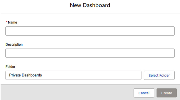
Figure 8.26: New Dashboard popup
Enter all the necessary details and choose a folder to save it in. The handling of folders and their sharing is identical to that of reports. After clicking Create, you will receive an empty board, which you will soon fill with charts.
Before creating new charts, let’s first enter the settings. Click on the gear icon. A Properties popup will appear on the screen, where you will find the name, description, and folder. It also includes options such as View Dashboard As, which is the choice of perspective from which data on the dashboard will be displayed, and Dashboard Grid Size, which determines how many columns the dashboard grid will have. At the bottom, there is the choice of the dashboard’s color palette, and you can get creative; look at the following image to see this:
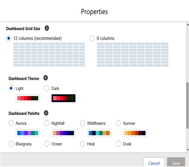
Figure 8.27: Dashboard settings
- The next step is to finally create new charts. To do this, click on the + Widget button, and among the three options, choose Chart or Table (the other two options are Text and Image).
Now, you canselect a report. Remember, for a chartto show something meaningful, group certain values. Without grouping, youcan only use a table, which is essentially like a list view. After selecting areport, a new screen will appear where you can set up the entire configuration.